CLIENT: Honee bleu
SERVICE(S): packing design, branding, ideation
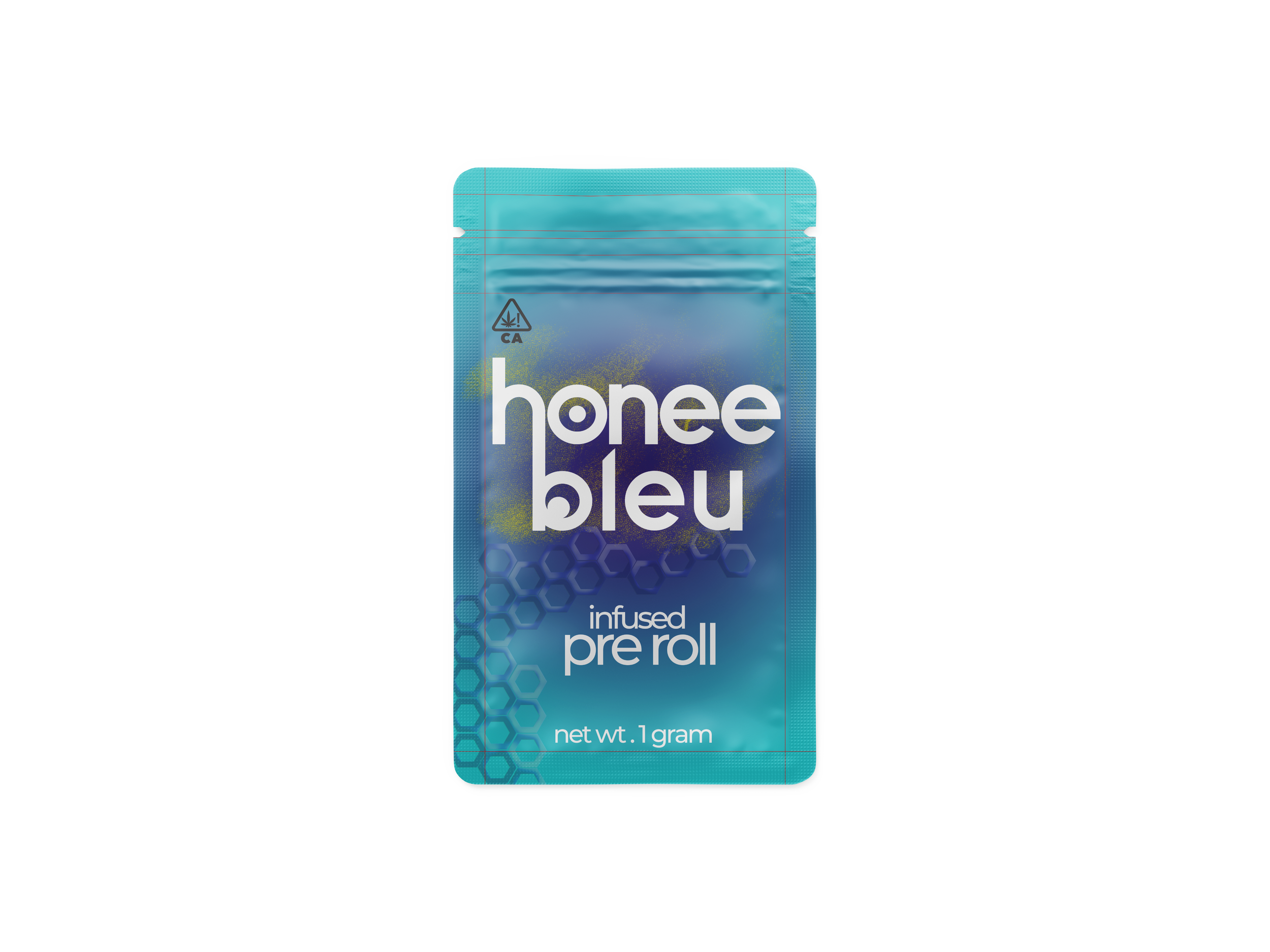
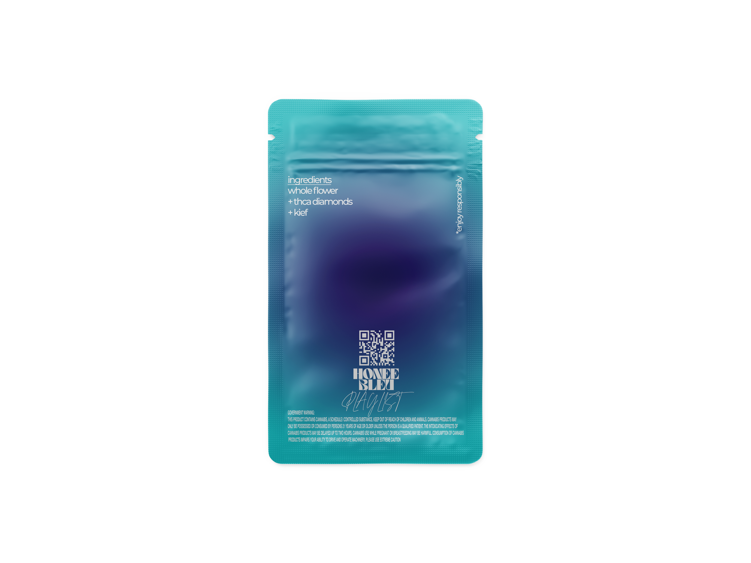
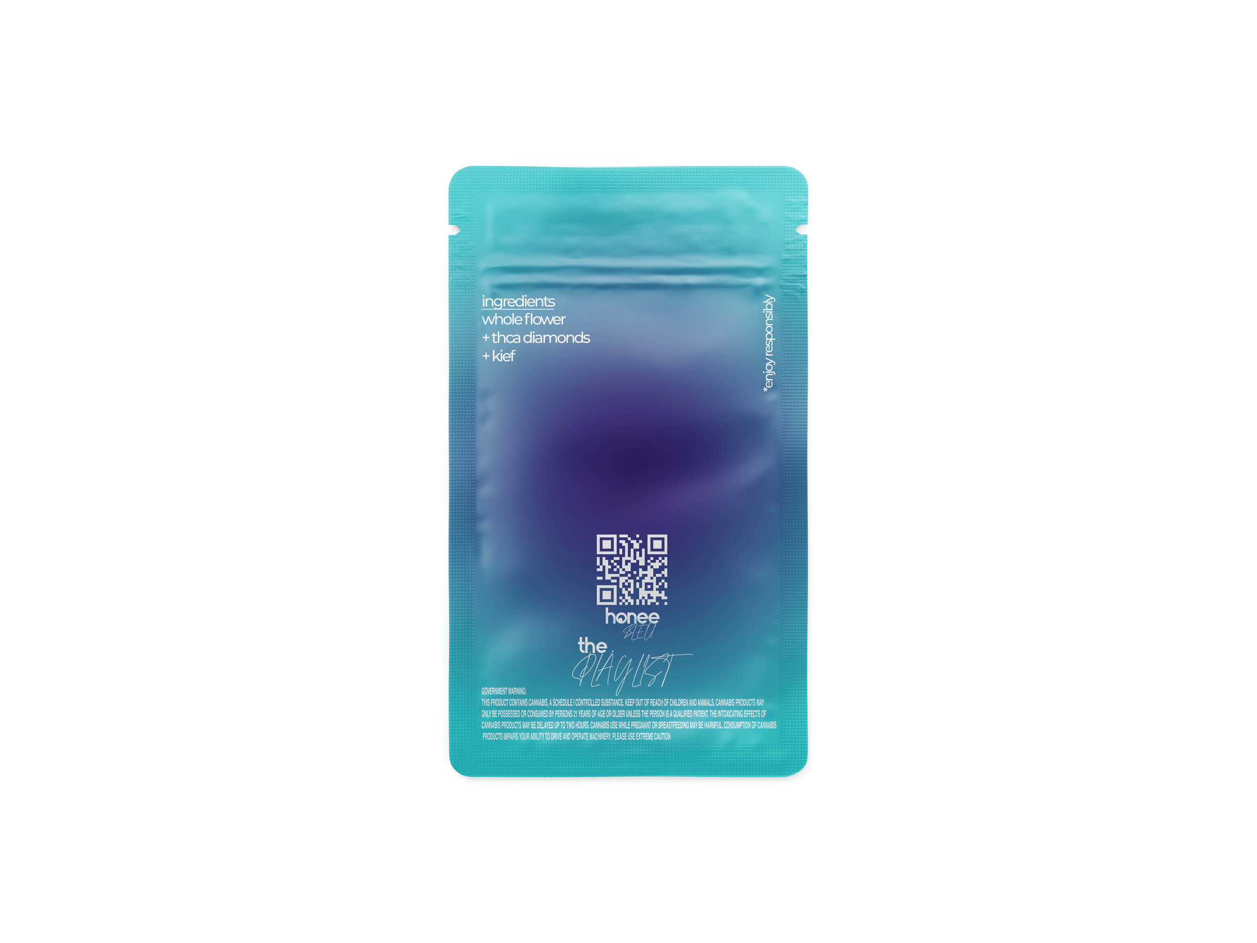
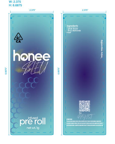
about: Honee Bleu was a California recreational cannabis brand built for people who care about the experience and the quality behind it. Known for infused pre-rolls and whole flower, the brand delivered a product lineup that felt elevated but still approachable—easy to understand, easy to enjoy, and designed to fit real life, not just dispensary hype.
As a minority-owned and operated company, Honee Bleu brought culture and community into the category in a way that felt authentic—not performative. And the market responded. The brand scaled quickly, landing in 10+ retail locations across Greater Los Angeles, proving it could compete on shelf, in conversation, and in repeat customers.
At its core, Honee Bleu stood for premium cannabis with a welcoming vibe: strong product, clean presentation, and a brand personality that felt like an invite—not a barrier.
Deliverables (Brand + Packaging + Retail Strategy):
Brand ideation + creation (name/voice/visual direction)
Rebrand for California legal market readiness
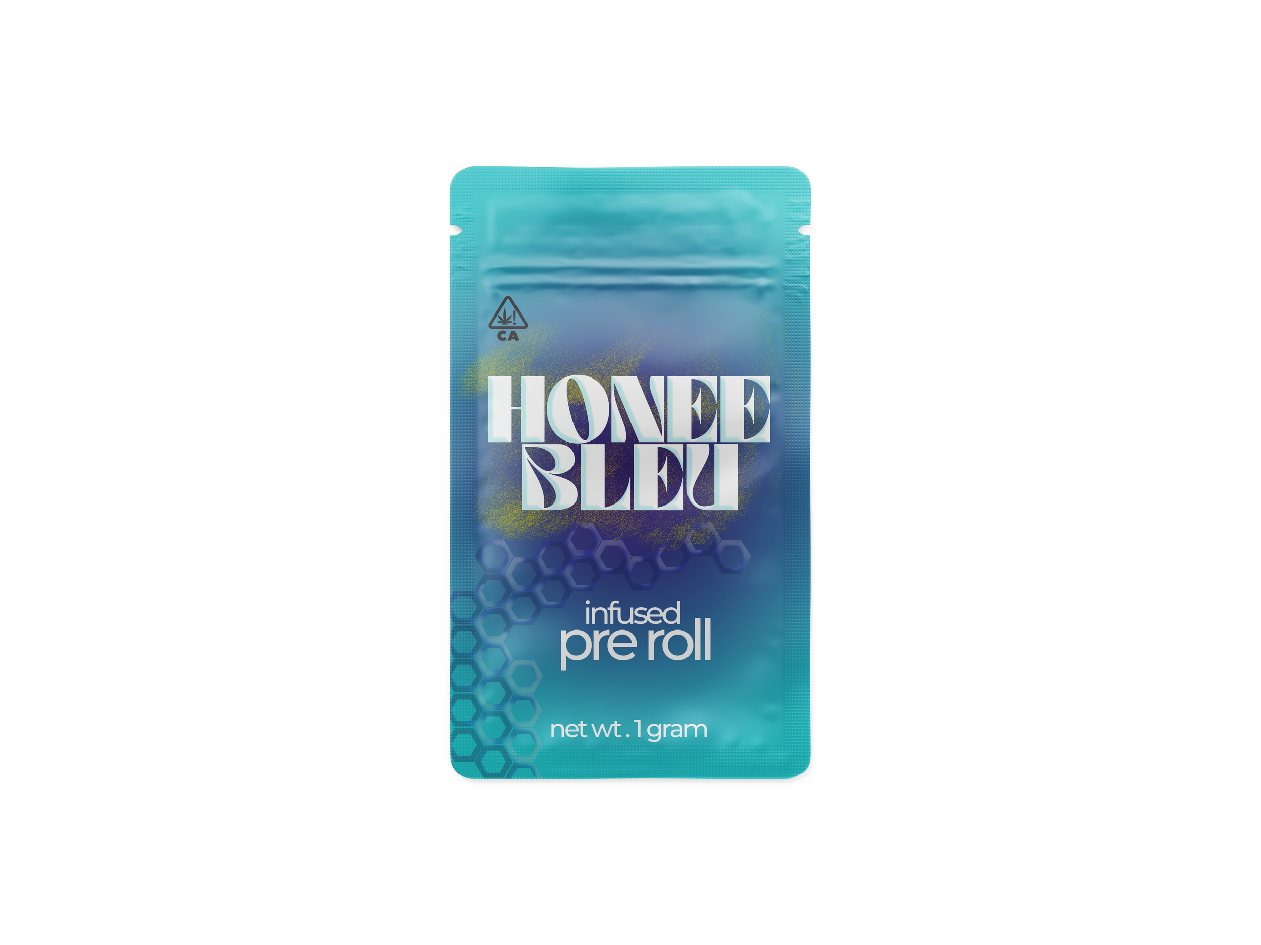
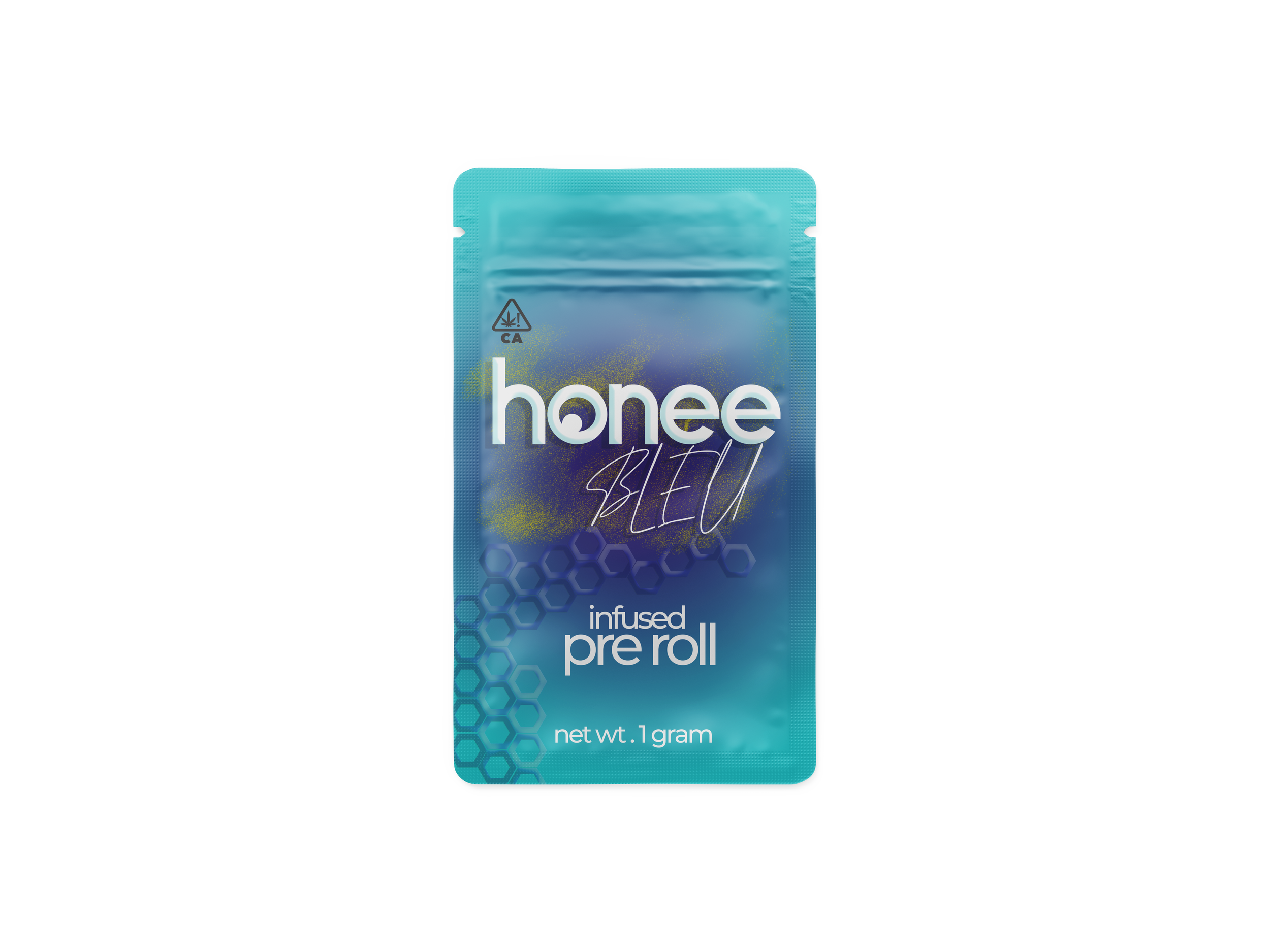
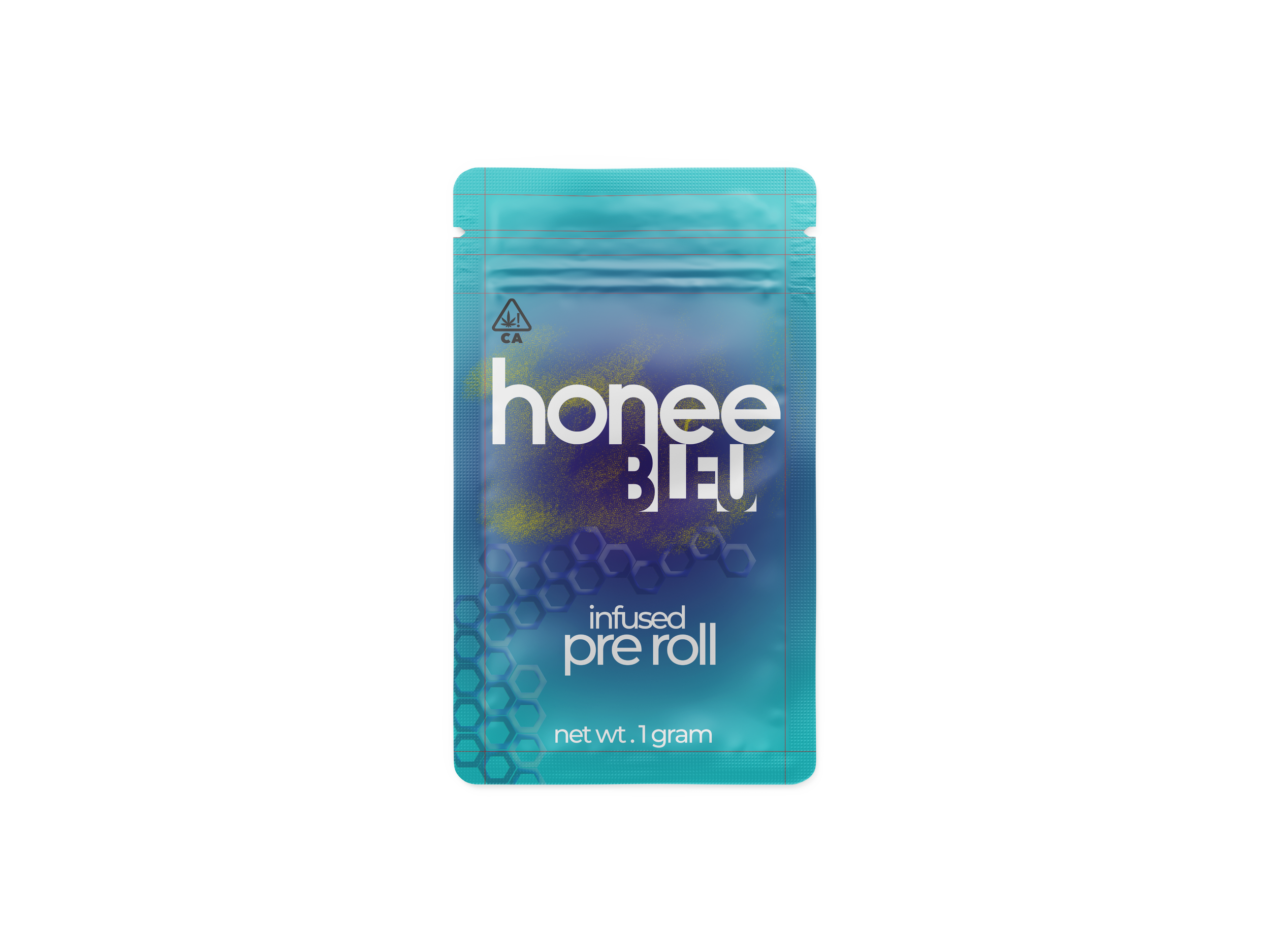
Packaging design across product formats
Packaging sourcing support
Retail-first packaging strategy (shelf impact + customer clarity)
The goal: A legal-market launch built to win at retail—clear brand, sharp packaging, and a strategy that made Honee Bleu easy to spot, easy to trust, and easy to buy.